Quick answer
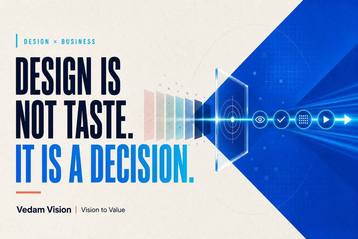
Design business strategy starts with the decision a customer needs to make. A colour, typeface, image, or layout should be judged by whether it helps the right person understand the offer, trust the evidence, and take the next step. Personal taste can guide exploration, but it is a weak approval standard. A stronger design review uses an agreed audience, objective, hierarchy, constraints, and measurable behaviour.
Design becomes expensive when a team discusses it as taste.
"I like blue."
"Make it look premium."
"This layout feels more modern."
These reactions are natural. They are also incomplete. None explains what the design must help a customer understand or do.
A useful design conversation begins with a business decision.
Who is the page for? What should that person notice first? Which doubt must the design reduce? What action should feel easier afterward?
Once those answers are clear, typography, colour, imagery, spacing, and interaction stop being isolated preferences. They become tools for directing attention and supporting trust.
The cost of taste-led design
Taste-led feedback creates three problems.
First, it has no shared standard. The founder likes one direction, the designer prefers another, and the sales team asks for a third. The loudest person wins.
Second, feedback arrives late and changes the wrong things. A team may spend days polishing a visual direction before anyone agrees on the customer, promise, or required proof.
Third, the design becomes hard to test. If success means "looking better," the team cannot tell whether the page improved the customer journey.
This does not mean taste is unimportant. Good creative judgment helps a brand avoid generic work and choose an appropriate tone. The mistake is using taste as the only reason.
Start with the customer decision
Every business design sits near a decision.
A home page helps a visitor decide whether the company is relevant. A pricing page helps a buyer compare options. A product package helps someone recognise the product and understand the promise. A proposal helps a client decide whether the scope and risk feel acceptable.
Write the decision in one sentence before reviewing the visual work.
For example: "A clinic visitor should understand the available speciality, trust the doctor information, and know how to book without calling reception first."
That statement gives the design team something to solve. The hierarchy must make the speciality visible. The proof must support trust. The booking action must be easy on a phone.
Vedam Vision's guide to building a brand identity that connects with an audience begins with positioning for the same reason. Visual decisions become easier when the audience, promise, and reason to believe are explicit.
Five questions for a better design review
1. Who is this for?
"Everyone" is not a useful answer.
Name the person, situation, and channel. A procurement manager comparing B2B vendors has different needs from a parent choosing a coaching institute on WhatsApp. A first-time visitor needs more context than a returning customer.
For Indian businesses, language, device, location, and buying process can matter. A design that assumes desktop research and card payment may fail for an audience using a low-cost phone and preferring WhatsApp or UPI.
2. What should they understand first?
Hierarchy is a business choice.
If the strongest visual element is the company slogan but the customer needs to see the service and city, the page is using attention badly. Decide which idea deserves the first three seconds.
The answer may be a product benefit, a specific service, an eligibility condition, a delivery promise, or a piece of proof. Keep the first message focused enough to understand without reading the entire page.
3. Which uncertainty must the design remove?
Customers pause when something important is unclear.
They may wonder whether the company serves their location, whether the price is within range, whether a product is genuine, what happens after enquiry, or whether support is available.
Good design makes the answer visible. It uses structure, labels, comparison, proof, and sequence. Decoration cannot compensate for missing information.
4. What action should feel easier?
Name the next step. It could be booking, comparing plans, downloading specifications, starting a WhatsApp conversation, adding a product to cart, or requesting a quote.
Then remove friction around that action. Use a clear label, an appropriate position, enough contrast, a manageable form, and honest expectations.
The W3C guidance on consistent navigation explains that predictable order helps users locate repeated content. This accessibility principle also reinforces a broader design truth: people act more confidently when the interface behaves as expected.
5. What evidence will show whether it worked?
Define the signal before launch.
A landing page might be measured by qualified form completions, calls, WhatsApp starts, and form errors. A pricing page might be measured by plan selection, sales questions, and drop-off. A proposal template might be reviewed through decision time, clarification requests, and scope errors.
Avoid treating one metric as perfect proof. Conversion can change because of traffic quality, season, pricing, or campaign message. Review the design in context.
Translate objectives into design choices
Once the business questions are clear, creative decisions become easier to explain.
Typography controls reading order
Large type is not automatically better. The size, weight, spacing, and line length should help the intended reader move through the information.
Use a clear hierarchy for the main promise, supporting explanation, proof, and action. Check it on the actual device. A headline that looks elegant on a desktop may become four awkward lines on a phone.
Colour carries function
Colour can signal brand recognition, state, priority, and interaction. It should not be approved only because a stakeholder likes it.
Define primary, supporting, alert, success, and neutral roles. Check contrast. Avoid using colour as the only way to communicate meaning.
Imagery sets expectation
Images tell customers what kind of business they are dealing with. A real manufacturing floor, a clear product detail, or an accurate team portrait can answer more than a generic stock photo.
Choose imagery based on the proof required. If buyers need to understand scale, show scale. If they need craft, show the work. If they need safety, show the process and standard without staging a false claim.
Spacing reveals priority
Spacing is not empty decoration. It separates ideas, groups related information, and controls pace.
A crowded page can make every item feel equally urgent. A spacious page can still fail if it hides important details. Use spacing to support the hierarchy, not to imitate a trend.
Design for an Indian SME journey
Consider a B2B solar installer serving several cities.
The home page may need to help a factory owner answer four questions quickly: do you serve my area, do you handle commercial capacity, what evidence supports the claim, and how do I request an assessment?
A taste-led review might debate whether green or blue feels more suitable. A decision-led review checks whether the capacity range is visible, whether case evidence is credible, whether the service area is clear, and whether the enquiry form asks for useful information without becoming exhausting.
The colour still matters. It simply comes after the business logic.
The same approach works for a restaurant menu, clinic appointment flow, coaching landing page, SaaS onboarding screen, or real-estate brochure.
Use a design system to protect decisions
A design system records choices that should not be debated every week.
It can define type scale, colour roles, spacing, buttons, form patterns, image direction, and content rules. The purpose is not to make every page identical. It is to keep repeated functions predictable and free the team to focus on the new problem.
W3C's cognitive accessibility guidance recommends consistent visual design across groups of pages, including repeated heading styles, controls, icons, and structure. Consistency helps people recognise options and tasks.
Vedam Vision's article on design systems for Indian product teams explains how to start with the components people actually reuse rather than a large document nobody follows.
How to give feedback without becoming the designer
Founders and business leaders should not disappear from the review. They hold important context about customers, operations, promises, and risk.
Give feedback in this order:
- Restate the agreed customer and objective.
- Describe the observed problem.
- Explain the business consequence.
- Ask for options rather than dictating a cosmetic fix.
Instead of saying "make the button red," say: "The booking action is difficult to find after the doctor profiles. We need patients to notice it without losing access to the fee and availability details. Show two ways to improve that hierarchy."
This gives the designer room to solve the problem while keeping the business need visible.
When taste should lead
Some choices cannot be reduced to a direct conversion metric.
Brand character, cultural tone, editorial style, and long-term distinctiveness require judgment. A team may choose a direction because it feels more honest, memorable, or appropriate to the category.
Even then, name the reasoning. Explain which audience signal, brand principle, or strategic tradeoff the choice supports.
Vedam Vision's branding and visual identity service treats brand work as a connected system of positioning, identity, guidelines, and collateral. Taste becomes more useful when it operates inside that system.
Frequently asked questions
What is design business strategy?
Design business strategy connects visual and interaction choices to an audience, business objective, customer decision, operating constraint, and measurable result.
Does business-focused design reduce creativity?
No. A clear objective gives creativity a problem worth solving. It helps teams explore distinctive directions without losing the customer or business need.
How should a founder review design work?
Review the audience, message hierarchy, uncertainty, proof, next action, accessibility, and channel constraints before discussing personal preference.
Which design metrics should an Indian SME track?
Use metrics tied to the page or asset, such as qualified enquiries, form completion, booking starts, product comparison, support questions, errors, and drop-off. Interpret them alongside traffic and business context.
When is a design system worth creating?
Create one when the same elements are being rebuilt, feedback is inconsistent, or customers encounter different patterns across pages and channels. Start with repeated components and decisions.
Make the decision visible
Beautiful work can still fail when it hides the important choice. Simple work can be powerful when it makes the right next step obvious.
Start every design review with the customer decision. Agree on the audience, first message, uncertainty, action, and evidence. Then use craft and taste to express that logic with clarity and character.
The result is not design with less creativity. It is design with a job.