Quick answer
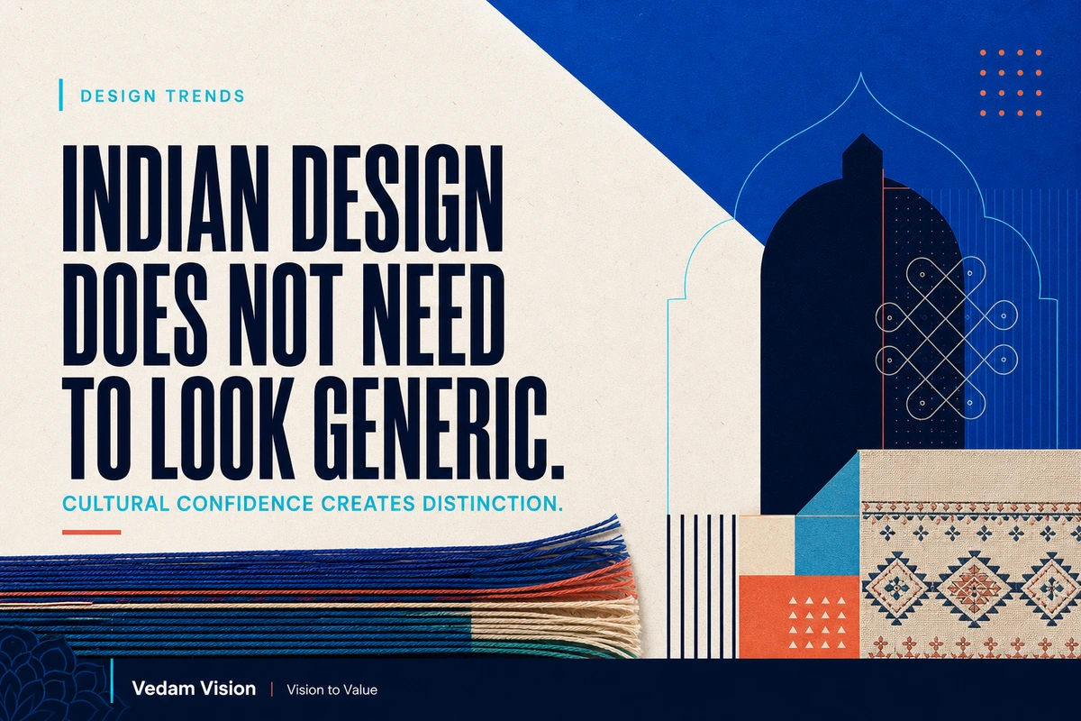
Indian design trends in 2026 point toward a more culturally confident visual language. Canva calls one part of this movement "GrannyWave": a revival of regional craft, handloom patterns, festival colour, Hindi typography, layered storytelling, and Bollywood-era glamour through a modern lens. The useful lesson is not to decorate every brand with heritage motifs. It is to stop treating culture as an afterthought and start using relevant visual memory as a source of distinction.
Generic minimalism is not bad design. It can create clarity, hierarchy, and calm. The problem begins when every brand borrows the same neutral palette, geometric type, soft gradient, and empty layout without asking whether those choices express anything specific.
For an Indian business, cultural confidence means making deliberate choices about what feels familiar, credible, and distinctive to its audience. It requires research, restraint, and respect. It is not permission to turn heritage into wallpaper.
What Canva's GrannyWave trend actually says
Canva's official 2026 Design Trends report describes a broader shift called "Imperfect by Design." The company says creators are combining AI-enabled production with a renewed interest in human texture, personal expression, and work that does not feel excessively polished.
Within its local market analysis, Canva identifies GrannyWave in India. The report connects the trend with nostalgia, regional crafts, handloom patterns, saturated festival-inspired colour, Hindi typography, and a touch of Bollywood-era glamour. Canva also reports year-over-year growth in searches for "Desi" and "Hindi Typography" on its platform.
These observations are signals from Canva's creator ecosystem. They are not a rule for every Indian brand, and they do not prove that maximalism will outperform minimalism in every market. They do show that designers and audiences are actively exploring visual language rooted in local memory.
That matters because accessible AI tools can make polished production abundant. When execution becomes easier, recognition and meaning become more valuable.
Why generic visual polish is losing power
The modern brand internet has developed a familiar look:
- muted neutrals
- clean geometric sans serif type
- generous empty space
- abstract gradients
- rounded cards
- simple line icons
- polished but interchangeable photography
This system works because it is easy to read and easy to reproduce. It is also easy to copy.
When a fintech company, design studio, software product, consultant, and café use the same visual grammar, aesthetics stop helping the audience understand who is speaking. The work may look professional without becoming memorable.
AI increases this pressure. A competent visual can now be generated, adapted, or templated quickly. That creates a flood of acceptable output. A brand that competes only on surface polish will find that advantage becoming cheaper.
Distinctiveness comes from a harder combination: clear positioning, relevant cultural knowledge, consistent behaviour, and recognizable execution.
Vedam Vision's guide to building a brand system rather than relying on a logo explains why recognition depends on more than one symbol. Message, visuals, behaviour, and proof need to create the same expectation.
Cultural confidence is not visual decoration
Cultural confidence begins before the mood board.
Ask what the brand believes, whom it serves, and which cultural references carry meaning for that audience. A craft cue, language choice, colour association, or storytelling rhythm should have a reason to exist.
Consider three different businesses:
- A handloom marketplace may place material texture, weaving structure, maker stories, and regional provenance at the centre of its identity.
- A B2B technology company serving Indian manufacturers may need clarity and operational trust first, with cultural cues appearing through language, photography, illustration, and examples rather than decorative pattern.
- A modern hospitality brand may use local architecture, food memory, signage, sound, and service rituals to create a sense of place.
All three can be culturally confident. They should not look the same.
The goal is not to prove that a brand is Indian by adding obvious motifs. The goal is to make the brand feel situated, understood, and difficult to confuse with a generic international template.
Five sources of meaningful visual distinction
1. Language and typography
Language affects tone, hierarchy, rhythm, and trust. Hindi typography is one visible part of India's multilingual design opportunity, but the principle extends to Bengali, Tamil, Telugu, Marathi, Gujarati, Malayalam, Kannada, Punjabi, Urdu, and other languages used by real audiences.
A bilingual system should be designed as a system. Check character support, weights, spacing, line height, punctuation, and how scripts sit together. Do not treat translated text as a smaller line added at the end.
2. Material and craft logic
Craft can influence structure without being copied literally. Weaving can inspire grids and interlocking relationships. Block printing can inform repetition and variation. Hand-painted signage can influence expressive type. Paper, fabric, ink, metal, wood, and stone can bring tactile character to digital work.
Study how the material is made and what it means. Credit collaborators and communities when their work contributes directly. Avoid extracting a recognizable tradition while removing its context.
3. Colour with context
India offers an enormous visual range. Festival colour is only one reference. Regional landscapes, architecture, textiles, transport, packaging, cinema, print culture, and everyday commerce all provide different palettes.
Choose colour for the brand's role and audience. A financial service still needs accessibility and trust. A children's product may carry more energy. A premium hospitality brand may use deep mineral tones rather than loud saturation.
Context prevents colour from becoming costume.
4. Storytelling rhythm
Not every culture organizes information around the same preference for reduction. Layered storytelling can feel rich and generous when hierarchy remains clear.
A design can hold detail without becoming confusing. The key is to establish an order of attention: the first idea, supporting evidence, texture, and discovery. Canva's report links several 2026 trends with tactile surfaces, cinematic storytelling, zine-like expression, and deliberate imperfection. The opportunity is controlled richness, not uncontrolled clutter.
5. Real local evidence
The strongest cultural signal may be the truth of the business itself: its people, products, environments, customers, and methods.
Photograph real materials. Show the workshop, store, city, process, or team when permission exists. Use customer language. Explain where a product comes from and why a decision was made.
Authentic evidence is harder to imitate than a decorative style.
A practical test for using heritage responsibly
Before using a cultural reference, review it through five questions.
Is it relevant?
Can you explain why the reference belongs to the brand, product, place, or audience? If the answer is only "it looks Indian," the connection is too weak.
Is it understood?
Research the origin, use, meaning, and variations of the reference. Similar-looking forms may carry different significance across regions and communities.
Is it transformed with purpose?
Modern interpretation should connect with the brand's position. Copying a motif into a background is not a design strategy.
Is it credited and compensated?
If artisans, photographers, illustrators, writers, or cultural specialists contribute, agree on fair credit, rights, and payment.
Is it usable?
The final system must work in real formats: mobile screens, packaging, signage, social posts, documents, and accessible digital experiences. Meaning does not excuse poor legibility.
Minimalism still has a job
The alternative to generic minimalism is not mandatory maximalism.
Minimalism remains useful when it removes distraction and strengthens a message. The important distinction is between intentional simplicity and borrowed sameness.
An Indian brand can be quiet, restrained, and culturally specific. Distinction may come from type, proportion, material, language, photography, or a single recurring detail rather than a dense composition.
Vedam Vision's article on why brand presence matters more than perfect polish offers a related test. A brand needs a recognizable point of view, not imperfection added as another fashionable effect.
How a founder should brief the design team
Replace the vague instruction "make it look premium" with a more useful brief:
- What should the audience understand in three seconds?
- What expectation should the brand own?
- Which places, materials, languages, or visual memories are relevant?
- Which references are inappropriate or overused?
- What evidence makes the brand's claim believable?
- Where must the system work?
- What accessibility requirements are non-negotiable?
- Which decisions should remain consistent across every channel?
Then ask the team to present the reasoning behind visual choices, not only a collection of attractive screens.
This improves both creativity and approval. Feedback can focus on whether a direction supports the strategy instead of whether one person likes a colour.
How AI should fit into culturally grounded design
AI can help teams explore composition, colour, texture, and variation. It can also flatten culture into an average of familiar symbols.
Use AI to widen exploration, then apply human judgment to selection and correction. Give the system specific context. Check language carefully. Look for invented scripts, mixed regional references, stereotypes, and visual details that appear plausible but are wrong.
Do not assume that an image model understands the meaning of a cultural form because it can reproduce its surface.
The best workflow combines research, direction, generation, critique, and expert review. Speed should create more room for judgment, not remove it.
Turn cultural memory into a modern system
Indian design trends in 2026 are useful because they reveal a growing appetite for work with place, texture, and personality. GrannyWave is one expression of that appetite, not a universal recipe.
Founders should take the deeper lesson.
Do not begin by asking how to make a brand look more Indian. Ask what the brand genuinely understands, values, and wants to preserve. Find the cultural and operational details that support that position. Translate them into a flexible system with clarity, accessibility, and respect.
The result may be bold or restrained. It may use handloom texture, regional language, local photography, or none of those things.
What matters is that the work has a reason to look the way it does.
Frequently asked questions
What is the GrannyWave design trend?
GrannyWave is Canva's name for an Indian visual trend that revisits heritage, regional craft, handloom patterns, festival-inspired colour, Hindi typography, layered storytelling, and Bollywood-era glamour through a modern lens.
Does every Indian brand need to use cultural motifs?
No. Cultural confidence is about relevant, well-researched choices. Some brands may express place through language, photography, material, service, or storytelling rather than motifs.
Is minimalism becoming outdated in Indian design?
No. Intentional simplicity remains valuable. The weakness is generic minimalism that makes unrelated brands look interchangeable and removes useful cultural or strategic character.
How can a company use heritage without becoming stereotypical?
Research the reference, connect it to the brand's real context, involve knowledgeable creators, provide credit and compensation, and test whether the result works beyond decoration.
What role should AI play in culturally grounded design?
AI can support exploration and production, but human researchers and designers must check meaning, language, accuracy, stereotypes, accessibility, and whether the final choices support the brand strategy.
\n