Quick answer
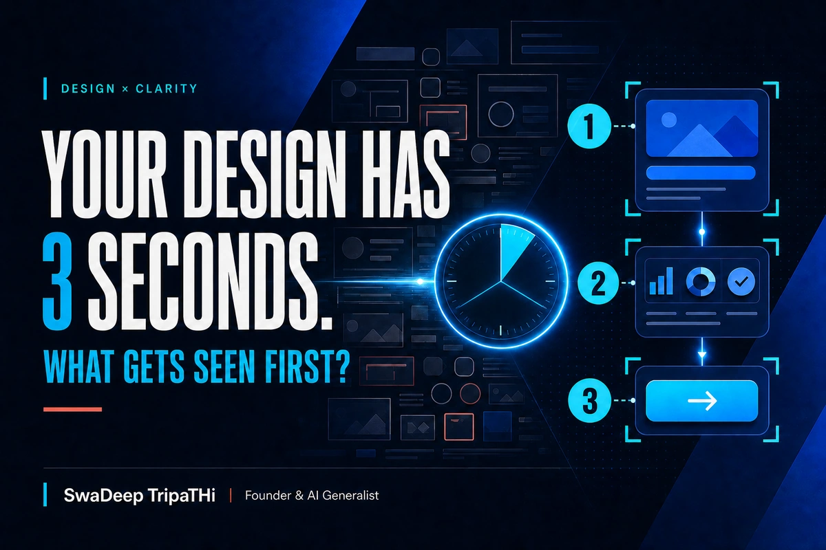
The three-second visual hierarchy test is a fast team check: show a design briefly, hide it, then ask what the viewer noticed first, what they think the page is about, and what action they would take. It is not a substitute for usability research or accessibility testing. It is a practical way to expose unclear priorities before a website, landing page, ad, or social creative reaches customers.
Most cluttered designs do not suffer from a lack of talent. They suffer from too many important things.
The logo must be large. The offer must stand out. The founder wants every service visible. Sales wants the phone number above the fold. Marketing wants a badge, proof, urgency, and three calls to action. Each request makes sense alone. Together, they create a page where nothing clearly leads.
Visual hierarchy is the decision about what people should notice first, second, and next. Size, contrast, spacing, position, type weight, colour, imagery, and movement all influence that sequence.
The three-second visual hierarchy test makes this priority visible. It asks a simple question: if someone gives the design only a short glance, does the intended message survive?
What the three-second visual hierarchy test is
This is an editorial and design heuristic, not a scientific promise that every visitor decides in exactly three seconds.
Use it during a review:
- Show the design at its realistic size for about three seconds.
- Hide it.
- Ask the viewer what they noticed first.
- Ask what they believe the page or creative is offering.
- Ask what they would do next.
Do not coach the viewer or explain the business first. Their unaided answer is the point.
If the first remembered element is a decorative shape, the main message may be too quiet. If the viewer understands the offer but cannot name the next action, the call to action may be weak or competing with other buttons. If different viewers describe entirely different pages, the hierarchy needs another pass.
The test is deliberately quick because it isolates initial priority. A full page still needs longer reading, interaction, mobile checks, and testing with representative users.
Why hierarchy matters for Indian SME websites
Many Indian business websites have to serve more than one audience. A manufacturer may speak to procurement teams, dealers, job applicants, and local partners. A clinic may serve patients, family members, corporate clients, and doctors. A coaching institute may need to explain courses, results, fees, locations, and enquiry routes.
The business is complex. The first screen cannot explain all of it at once.
Good hierarchy does not remove useful information. It stages it. The visitor gets one clear promise, one supporting reason, and one sensible next step before being asked to process the details.
This matters even more on a phone. Narrow screens reduce the number of elements visible together. Long headlines wrap. banners grow taller. Floating WhatsApp buttons can cover important controls. A layout that feels calm on a desktop monitor may become a queue of competing blocks on mobile.
Vedam Vision's guide to mobile-first web design for Indian audiences is useful when the hierarchy must work across smaller screens, variable connections, and real customer contexts.
Visual hierarchy is not only about making things bigger
Size is powerful, but it is one tool.
A large headline can still lose to a bright photograph. A primary button can still disappear if several other buttons use the same colour and weight. A small label can attract attention when it sits alone in generous empty space.
The official GOV.UK guidance on social typography describes weight and scale as effective ways to build hierarchy, while keeping body text readable through suitable line spacing and contrast. Its web design system also recommends consistent heading styles that create a clear content structure.
Think of hierarchy as a coordinated set of signals:
| Signal | What it communicates | Common mistake |
|---|---|---|
| Size | Relative importance | Making several elements equally large |
| Contrast | Immediate emphasis | Using strong contrast everywhere |
| Spacing | Grouping and separation | Filling every gap with content |
| Position | Reading order and priority | Placing the main action after secondary material |
| Type weight | Emphasis within text | Bold text becoming the default |
| Colour | Brand meaning and action | Relying on colour alone |
| Imagery | Mood, context, and focus | Letting a decorative image overpower the offer |
The strongest hierarchy usually uses fewer signals with more discipline.
Run the test in five practical steps
Step 1: Define the intended sequence
Before showing the design, write down the three things a viewer should notice:
- Main message
- Reason to believe
- Next action
For a B2B landing page, that sequence might be:
- Inventory software for multi-location retailers
- Trusted by named retail businesses
- Book a demo
If the team cannot agree on the sequence, the design cannot solve the disagreement. Settle the business priority first.
Step 2: Show the realistic version
Test the actual design at a realistic size. A desktop homepage shown as a tiny slide gives the wrong evidence. A mobile design should be viewed on a phone-sized screen. A LinkedIn graphic should be tested at the size it appears in a feed.
Remove distractions around the design. Show it for roughly three seconds, then replace it with a blank screen.
Step 3: Ask neutral questions
Use the same three prompts for every viewer:
- What did you notice first?
- What do you think this is about?
- What would you do next?
Avoid asking, "Did you see the button?" That question reveals the expected answer.
Step 4: Compare answers with the intended sequence
Record the responses rather than debating them in the room. A small table is enough.
| Viewer | First noticed | Understood offer | Next action clear |
|---|---|---|---|
| A | Hero image | Partly | No |
| B | Discount badge | Yes | Buy now |
| C | Logo | No |
The pattern matters more than one unusual answer. If four of five people miss the main message, revise it. If one person sees a different detail, note it and continue testing.
Step 5: Change one priority at a time
Do not redesign the entire page after every round. First reduce competition around the main message. Then clarify the supporting proof. Then strengthen the next action.
Changing one layer at a time helps the team understand what improved the result.
The first layer: make the message unmistakable
The main message is not necessarily the company name. It is the most useful idea for the visitor at that moment.
Compare these two opening statements:
- Welcome to ABC Technologies
- Reduce stock mismatches across every store
The first identifies the business. The second identifies a customer outcome. The logo can still handle identity while the headline carries the offer.
Keep the main headline focused. Do not force it to explain the audience, service list, geography, differentiator, proof, and promotion in one sentence. Use a supporting line for the most important context.
Vedam Vision's article on conversion-focused landing page design for Indian SMBs shows how message priority and page structure can support a specific conversion goal.
The second layer: make proof easy to connect
Proof should support the main message, not start a separate conversation.
Useful proof might include a recognised client, certification, case result with proper evidence, product demonstration, review, sample, or clear process. Place it near the claim it supports.
A row of unexplained logos at the bottom of the page may be credible, but it does little for the first-screen promise. A concise proof line near the headline is easier to connect.
Avoid invented numbers and vague badges. "Trusted quality" is a claim. A named certification or a verifiable customer review is evidence.
The third layer: make the next action obvious
A user should not have to compare five equally loud actions.
Choose one primary action for the page state. Secondary actions can remain available with lower visual weight. A homepage may prioritise "Book a consultation" while keeping "View work" as a text link. A product page may prioritise "Add to cart" while keeping "Ask on WhatsApp" accessible but quieter.
This does not mean every page needs an aggressive button. The action should match the visitor's readiness. On an educational article, the next action may simply be continuing to a related guide.
Accessibility is part of hierarchy
Hierarchy that works only for a fully sighted mouse user is incomplete.
The W3C Web Content Accessibility Guidelines 2.2 require information and relationships conveyed visually to be available programmatically, and require a meaningful sequence when presentation order affects meaning. WCAG also says colour should not be the only way information is communicated.
For normal text, WCAG Level AA sets a minimum contrast ratio of 4.5:1, with a 3:1 threshold for large-scale text. The W3C's plain explanation of minimum contrast is a practical reference when checking design choices.
Use actual heading elements in a logical order. Do not create a visual heading by making a paragraph large and bold. The W3C headings tutorial explains how descriptive headings support navigation and content structure.
The three-second test can reveal visual competition, but it cannot verify keyboard navigation, screen-reader structure, reflow, focus visibility, or every contrast state. Run those checks separately. Vedam Vision's guide to web accessibility standards for Indian businesses translates the broader standard into a practical website audit.
Common reasons the test fails
The hero image is doing too much
A high-contrast face, bright product, or complex illustration can pull attention away from the message. Crop or position the image to support the headline. Add a restrained overlay if the text needs separation.
Every stakeholder received a button
Multiple actions often reflect unresolved business priorities. Decide what the page is for. Keep other routes available without giving them equal emphasis.
The design uses one type size
When labels, headings, supporting copy, and actions have similar scale and weight, the reader has to build the structure alone. Define a small type scale and use it consistently.
Cards look equally important
A grid of six identical cards tells the visitor that all six choices deserve equal attention. If one service, plan, or action is the usual starting point, give it a clear but honest priority.
Mobile hierarchy was treated as a crop
Responsive design is not shrinking a desktop arrangement. Reorder content, shorten supporting copy, check line breaks, and test sticky or floating elements on a narrow screen.
Test more than the homepage
The homepage is only one entrance. Customers may land directly on a service page, product page, article, campaign page, or shared proposal.
Run the visual hierarchy test on the screen where a decision happens:
- Landing page hero
- Product or service header
- Pricing comparison
- Checkout or enquiry form
- Social media creative
- PDF proposal cover
- Email header and primary action
A consistent design system makes these tests easier because heading levels, buttons, spacing, and content patterns already have defined roles. Vedam Vision's guide to design systems for Indian startups explains how reusable decisions reduce inconsistency as a business ships more pages and campaigns.
When to use a deeper test
Move beyond the three-second check when the task is important, complex, regulated, or expensive to get wrong.
Use moderated usability testing to see whether people can complete a task. Use first-click testing when the initial path matters. Use analytics and session recordings to identify behaviour at scale, with appropriate privacy controls. Use accessibility testing with automated tools and human review.
The quick hierarchy test is valuable because it is cheap and early. Its job is to catch an obvious priority problem before deeper testing begins.
Frequently asked questions
Is the three-second visual hierarchy test scientifically proven?
It should be treated as a practical design-review heuristic, not a universal scientific rule about human attention. It can reveal whether intended priorities are visible, but it does not replace representative usability research, analytics, or accessibility testing.
How many people should review a design with this test?
A few independent reviewers can expose obvious hierarchy problems during an early design round. Use more representative participants and structured research when the page supports an important customer task or business decision.
What should viewers notice first on a business website?
Usually, they should notice the most relevant customer promise or task, followed by a credible reason to believe it and a clear next action. The exact sequence depends on the page's purpose and the visitor's intent.
Can visual hierarchy improve conversion rates?
Clear hierarchy can make an offer and action easier to understand, but it does not guarantee conversion. The offer, traffic quality, trust, performance, usability, and follow-up process also affect results. Measure the complete journey.
Does visual hierarchy work the same on mobile and desktop?
The principles are similar, but the execution changes. Mobile screens reveal fewer elements at once, create different line breaks, and may include sticky or floating controls. Test each important viewport in its realistic context.
Clarity begins with one decision
Better design does not begin by adding polish. It begins by deciding what matters most.
Write the intended sequence before the review. Show the real layout for a brief moment. Ask neutral questions. Compare what people noticed with what the business intended. Then reduce the competition around the message, proof, and action.
That is the value of the three-second visual hierarchy test. It turns a vague argument about whether a design "pops" into a useful conversation about priority.
If your website has too many competing messages, Vedam Vision's website design and development service can help turn the business goal into a clearer page structure and visual system.