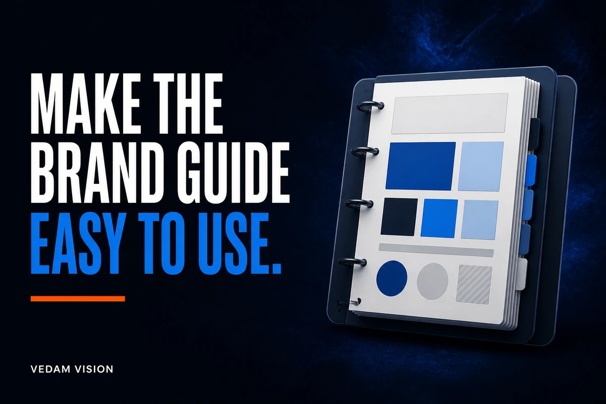
Brand guidelines for small business should be a short working manual that answers the decisions a team makes repeatedly: which logo file to use, how the business describes itself, which colours and type styles are approved, what imagery fits, and who approves an exception. The most useful guide is not the longest one. It is the guide a founder, marketer, salesperson, and external partner can apply without guessing.
Start with the business decisions, document the minimum visual and verbal system, test the rules in real work, and assign an owner. A practical first version can be compact, but every rule should include an example, a reason, and a clear action.
Begin with the jobs the guidelines must do
Do not open a design tool first. List the moments when the team currently loses time or creates inconsistent work. Common examples include choosing an old logo, changing a service description, inventing a new colour for a presentation, using an unsuitable stock image, or rebuilding the same social layout.
Review the services overview, proposals, active social channels, email templates, and sales materials. Note every repeated decision. These are the jobs the guide must cover. A rule that never affects real work can wait for a later version.
Define the primary users as well. A founder may need positioning and approval rules. A content writer needs voice, terminology, and examples. A designer needs exact assets, colour values, type hierarchy, spacing, and layout patterns. A sales team needs approved offer descriptions and proof rules. Writing for named users makes the guide easier to navigate.
Write a one-page brand foundation
Before visual rules, give the team a shared answer to five questions: who the business serves, which problem it solves, what it offers, why a suitable buyer may choose it, and what the business can responsibly promise. Keep the wording plain enough for a new team member to understand.
Add a short audience note describing the buyer's situation, priorities, objections, and level of knowledge. Avoid invented demographic detail. Base the description on actual customer conversations, enquiries, support questions, and sales records that the business is permitted to use.
Then define three to five principles that guide communication. For example, “specific before impressive” tells a writer to replace inflated claims with concrete information. “Show the next step” tells a designer and writer to make calls to action visible. A principle should change a decision, not merely sound positive.
Protect the official logo without turning the guide into a logo catalogue
Include only current, approved logo files. Show the primary version, permitted alternate versions, clear space, minimum practical size, background rules, and prohibited changes. Provide direct links to the source files rather than asking people to copy a logo from a website or screenshot.
WIPO explains that a trademark is a sign capable of distinguishing the goods or services of one enterprise from those of others. Registration, availability, and protection vary by jurisdiction, so brand guidelines do not replace a trademark search or legal advice. They do help the team preserve the approved mark consistently.
State the rule plainly: do not redraw, stretch, crop, recolour, rotate, add effects, or ask an image generator to imitate the logo. If a platform cannot support the correct asset, use an approved text treatment or consult the brand owner.
Give colours functional roles
A list of colour swatches is not enough. Assign each colour a role such as primary action, accent, heading, body text, surface, border, success, warning, or error. Include HEX values for digital work and the appropriate production values for any print use the business actually needs.
Show approved combinations. W3C's WCAG 2.2 guidance states that normal text should have a contrast ratio of at least 4.5:1, while qualifying large text can use at least 3:1. Logos have an exception, but body copy, buttons, navigation, form labels, error messages, and informative graphics do not become readable simply because a colour is part of the brand.
Do not rely on colour alone to show status. Pair colour with a label, icon, pattern, or other cue. Test the combinations on real pages, not only isolated palette cards.
Define a small typography system
Small teams usually need fewer type styles than they expect. Define the approved typefaces, safe fallbacks, weights, sizes, line heights, and roles for headings, body copy, labels, captions, and data. Include examples of a page title, section heading, paragraph, list, button, and form label.
The U.S. Web Design System treats typography as a set of structured design tokens and notes that deliberate type choices support readability and clear hierarchy. The practical lesson for a small business is to specify roles and relationships, not to give people a folder of fonts and hope they create the same hierarchy.
Test long headings, mobile screens, tables, and paragraphs. A display face that works in a campaign headline may be unsuitable for navigation or body text. Keep important website copy as real text wherever possible so it can remain responsive, selectable, and accessible.
Make the voice usable with before-and-after examples
Choose three or four voice principles and explain each with an instruction. “Clear” could mean lead with the answer, use familiar words, and remove unnecessary qualifiers. “Confident” could mean state verifiable capabilities directly without exaggeration. “Helpful” could mean explain the next step and any limitation.
Separate voice from tone. The brand's underlying character can remain stable while the tone changes for a proposal, a payment reminder, a service update, or an error message. A celebratory tone does not belong in every situation.
Create a small terminology table. List approved service names, audience terms, calls to action, proof language, and words to avoid. Link each service name to the correct page or internal description. Compare this table with the working process so the promises in marketing match the experience after an enquiry.
Turn imagery preferences into selection rules
“Use modern images” is not actionable. Define subjects, composition, lighting, colour treatment, crop, energy, and purpose. State what the image should help a reader understand. For a service business, useful images may show a real process, tool, decision, deliverable, or team member when permission is clear.
Document what to avoid, including misleading scenes, fake results, unlicensed assets, distorted logos, unnecessary text, or imagery that implies clients and facilities the business does not have. Include preferred aspect ratios for the website, blog, LinkedIn, Instagram, and presentations only if those channels are active.
Use the portfolio as a reality check. The visual direction should support work the business can honestly show. It should not create a public identity that the actual experience cannot sustain.
Document layout patterns, not dozens of templates
Define a spacing rhythm, alignment approach, page width, grid, image placement, corner treatment, and density. Then show a few patterns the team repeatedly needs, such as a hero section, service card, proof block, article callout, social post, proposal page, and call to action.
The GOV.UK Design System demonstrates how colour, images, layout, spacing, and typography can be documented as reusable styles. A small business does not need a government-scale system, but it benefits from the same principle: explain how elements behave in context.
Do not force every message into one template. A comparison, announcement, tutorial, and case study have different information needs. Keep the visual relationships consistent while allowing the composition to serve the content.
Use examples that answer “what do I do now?”
Every important rule should have one approved example and, where useful, one prohibited example. Instead of writing “use adequate spacing,” show the spacing values in a real card. Instead of writing “keep the logo small,” show the accepted footer treatment. Instead of writing “sound human,” show a rewritten paragraph.
Create a quick-reference page for frequent decisions. It can contain current asset links, colour roles, type styles, image rules, standard service names, social dimensions, and the approver's name. Link from this page to deeper guidance when a task needs more detail.
Place the guide where the team already works. A beautiful PDF hidden in a download folder will not improve consistency. Use a shared, controlled location, retain source files, and archive superseded versions so people can identify the current one.
Test the guide with real tasks before approval
Give the draft to people who did not write it. Ask one person to create a social post, another to update a proposal, and another to describe a service using only the guide. Observe where they pause, interpret a rule differently, or cannot find an asset.
Review the outputs against a short checklist: correct message, approved logo, colour role, type hierarchy, suitable image, readable contrast, accurate service language, and clear next step. The goal is not to catch a person making mistakes. It is to find gaps in the system.
Also test customer-facing touchpoints. The contact page should use the same terminology and tone as the service pages. The blog library should feel related to the main website even when article topics and images vary.
Assign ownership and a simple change process
Name an owner for the guide, an approver for significant exceptions, and people responsible for logo assets, templates, website components, and messaging. Define what counts as a minor correction and what requires review.
Add a version number, update date, and change log. Review the guide when the business adds a service, enters a market, changes an audience, identifies an accessibility issue, or finds a repeated production problem. Do not redesign the system because someone is bored with it.
Measure whether the guide reduces repeated questions, incorrect assets, rework, and inconsistent service descriptions. Ask users what remains unclear. These signals are more useful than judging the guide by its page count.
A practical minimum for the first release
The first release should include the one-page foundation, current logo assets, colour roles and combinations, typography roles, voice principles, approved terminology, imagery rules, core layout patterns, real examples, asset links, owner, and change process. Add specialist guidance only when a real channel or workflow needs it.
Before launch, check the guide against the case study library and existing public work. Correct inconsistent names and outdated assets in priority touchpoints, but preserve records whose historical context matters.
If your team keeps rebuilding brand decisions, a structured website and brand audit request can help identify the most visible gaps. The useful outcome is not a larger rulebook. It is a smaller number of clear, tested decisions that help people produce accurate work with confidence.
Brand guidelines should remove guesswork
Effective brand guidelines for small business turn strategy into daily choices. They protect official assets, make messages consistent, improve accessibility, reduce unnecessary design decisions, and give partners a reliable starting point.
Build the guide around real jobs, keep the system compact, show examples, test it with the people who will use it, and give it an owner. When the guide helps a team answer the next decision quickly and correctly, it is doing its job.