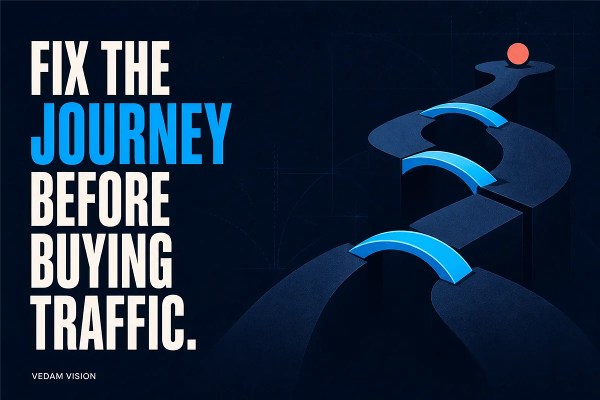
Before buying more traffic, fix the path from visitor intent to a useful sales conversation. That means checking measurement, message clarity, offer relevance, proof, navigation, form friction, mobile performance, follow-up, and the quality of the enquiries already arriving. More ad spend cannot reliably repair a confusing website journey.
This guide explains how to improve B2B website leads without assuming that every business needs a redesign. The right intervention may be a clearer page, a smaller form, a better qualification path, a faster response, or more accurate tracking. None of these changes guarantees conversions. They create a stronger basis for testing whether paid traffic can work.
Separate a traffic problem from a conversion-capacity problem
Start with a simple distinction. A traffic problem means too few relevant people reach the site. A conversion-capacity problem means relevant people arrive but cannot quickly understand the offer, trust the provider, or take an appropriate next step. Many businesses have both.
Do not diagnose this from one top-line conversion rate. Break the journey into stages: qualified visit, service-page engagement, proof interaction, form start, form completion, valid enquiry, sales response, qualified conversation, and outcome. A sharp drop at one stage points to a different action than a general lack of relevant visitors.
Review acquisition source, page, device, geography, and intent where the available data is reliable. Add qualitative evidence from sales calls, chat conversations, search terms, support questions, and form feedback. A dashboard can show where people leave, but it rarely explains why.
Fix measurement before making a design decision
Define a lead in operational terms. A form submission is an event; it is not automatically a qualified lead. Decide which outcomes matter, how duplicates and spam are handled, and how the website record connects to the sales process.
Check that analytics, consent settings, call tracking, form events, and CRM fields record the same journey consistently. Test each form yourself on mobile and desktop. Confirm that successful submissions reach the backend, trigger the intended notifications, preserve useful source data, and show the visitor a clear confirmation.
If tracking is incomplete, establish a baseline period before judging a change. Do not retroactively invent precision. Record the gap and use the best available evidence with an explicit limitation.
Make the first screen answer the buyer's first questions
A B2B visitor usually needs to know what you do, who it is for, what business situation it addresses, why the claim is credible, and what to do next. The first screen does not need every detail, but it should establish the direction.
Replace broad promises with a specific proposition. "We help" is not enough unless the rest of the sentence identifies the audience, problem, and form of value. Avoid unsupported words such as guaranteed, best, revolutionary, or number one. The FTC's advertising guidance is a useful reminder that objective claims need a reasonable basis.
Match the message to the source. Google's landing-page guidance emphasises relevance, usefulness, clear expectations, and easy navigation. An ad for a website audit should lead to a page about that audit, not a generic home page. The headline, proof, and action should continue the promise the visitor clicked.
Give each important intent a focused page
A single services page may be appropriate for exploration, but high-intent visitors often need a focused explanation. A useful service page covers the situation, fit, approach, scope, boundaries, proof, and next step. It should also help an unsuitable buyer recognise that the service is not for them.
Review the live services overview and the relevant page, such as website design and development, as separate stages. The overview supports orientation. The focused page supports evaluation. Do not duplicate the same generic paragraph across both.
Where search or campaigns target several industries or locations, resist generating thin pages that change only a place name. Each indexable page should have a genuine purpose and distinctive value for its audience. Google's people-first content guidance supports creating content for people rather than primarily manipulating search visibility.
Use proof that helps the buyer evaluate fit
Proof is not a wall of logos. Show the type of work, the decision, the relevant evidence, and the limitations. A buyer assessing a complex service needs context around any result. Link to a useful portfolio or case studies, but bring the most relevant proof into the decision page as well.
Use testimonials only with permission and preserve their meaning. Do not invent client names, quotes, ratings, or outcomes. If a result is anonymised, say so and retain the evidence privately. Explain what the example can demonstrate and what it cannot.
Reduce form friction without removing useful qualification
Ask only for information needed for the next step. W3C's accessible forms guidance recommends clear labels, instructions, and error messages, and it advises keeping forms simple. A short form is not always better if it creates a poor handoff. The goal is proportionate effort.
For an initial B2B enquiry, name, work email, company, relevant service, and a short context field may be enough. Phone number, budget, timeline, or website URL can be optional or required when the next action genuinely depends on them. Explain why sensitive or unusual information is requested.
Use visible labels rather than placeholders alone. Make errors specific and preserve the visitor's input after validation. Ensure the submit button has a clear action label. Prevent repeated submissions, provide an accessible success message, and offer an alternative contact route.
Test the contact page and free audit as complete workflows, including the backend record and the human response. A beautiful confirmation screen does not help if the lead never reaches the team.
Improve speed and mobile usability where they affect the journey
Performance matters because a slow or unstable page interrupts attention and action. Use real-user data where available, then confirm with lab testing. Web Vitals provide standard signals for loading, interaction, and visual stability, but a score is a diagnostic input rather than a sales guarantee.
Start with the largest visible content, image delivery, unused scripts, third-party widgets, and layout shifts around forms or calls to action. Convert appropriate images to modern formats, serve responsive sizes, and avoid loading large media that is not visible. Do not remove useful information merely to improve a score.
On mobile, check tap targets, menus, sticky buttons, chat tools, field types, keyboard behaviour, and the space around the primary action. The page should remain usable without forcing the visitor to fight overlapping widgets.
Make the next step match the buyer's readiness
Not every visitor is ready for a sales call. Offer one primary next step and, when useful, a lower-commitment route such as a practical article, a checklist, or an audit. Avoid presenting five equal buttons.
Write the action around what happens next: "Request an audit," "Share your project context," or "Book a scope review" is clearer than "Submit." Explain the response time and what the team will do with the information. Do not promise an immediate response if the operating process cannot support it.
A good lead journey also makes it easy to decline or redirect a poor fit. That protects the visitor's time and the sales team's capacity.
Repair follow-up before increasing volume
More leads can expose a weak follow-up process. Map who receives the enquiry, how it is acknowledged, when a person reviews it, what information is checked, and how the outcome is recorded. Create a fallback if email delivery fails.
Customise the first response to the context the visitor provided. Avoid an immediate sequence of generic messages. Respect consent, privacy, and channel-specific rules. Keep only the data necessary for the stated purpose and give people a clear route to stop marketing contact.
Review lead outcomes with marketing and sales together. If a campaign appears efficient but the enquiries are irrelevant, the optimisation target is wrong.
Run controlled tests in a sensible order
Do not change the headline, layout, form, traffic, and follow-up at the same time unless the current experience is broken and requires a full repair. Otherwise, you will not know what helped.
- Fix broken tracking, forms, notifications, and mobile blockers.
- Clarify the audience, offer, proof, and primary action.
- Reduce unnecessary form friction and improve confirmation.
- Improve speed and stability around the decision path.
- Repair response ownership and lead-quality feedback.
- Run a bounded traffic test with a clear hypothesis and review point.
Choose a period and sample appropriate to the traffic available. Low-volume B2B sites may need longer observation and more qualitative evidence. Avoid declaring a winner from a handful of visits.
Use a paid-traffic readiness gate
Increase spend only when the destination is functional, relevant, mobile-usable, measurable, and supported by a real follow-up process. Confirm:
- the target visitor and search or campaign intent are defined;
- the page continues the promise of the ad or referral source;
- claims and proof have a reasonable basis;
- navigation and primary action are clear;
- forms work, errors are accessible, and notifications arrive;
- speed and mobile blockers have been addressed;
- lead quality and sales outcomes can be reviewed;
- someone owns timely, context-aware follow-up.
If several checks fail, more traffic will mostly produce more ambiguity. Fix the highest-friction stage first and keep the test small enough to learn safely.
Improve the journey, then decide whether to buy traffic
The purpose of this work is not to delay advertising forever. It is to make the investment interpretable. When the page, form, measurement, and follow-up are working together, paid traffic can test a defined proposition instead of amplifying an unknown problem.
Use the Vedam Vision process and practical guidance in the blog to examine the journey. If you want an outside view, request a free audit or contact the team with the page, audience, current traffic source, and the lead-quality problem you are seeing. Share real context, not just the conversion rate. The most useful starting point is the stage where a relevant buyer currently loses confidence.