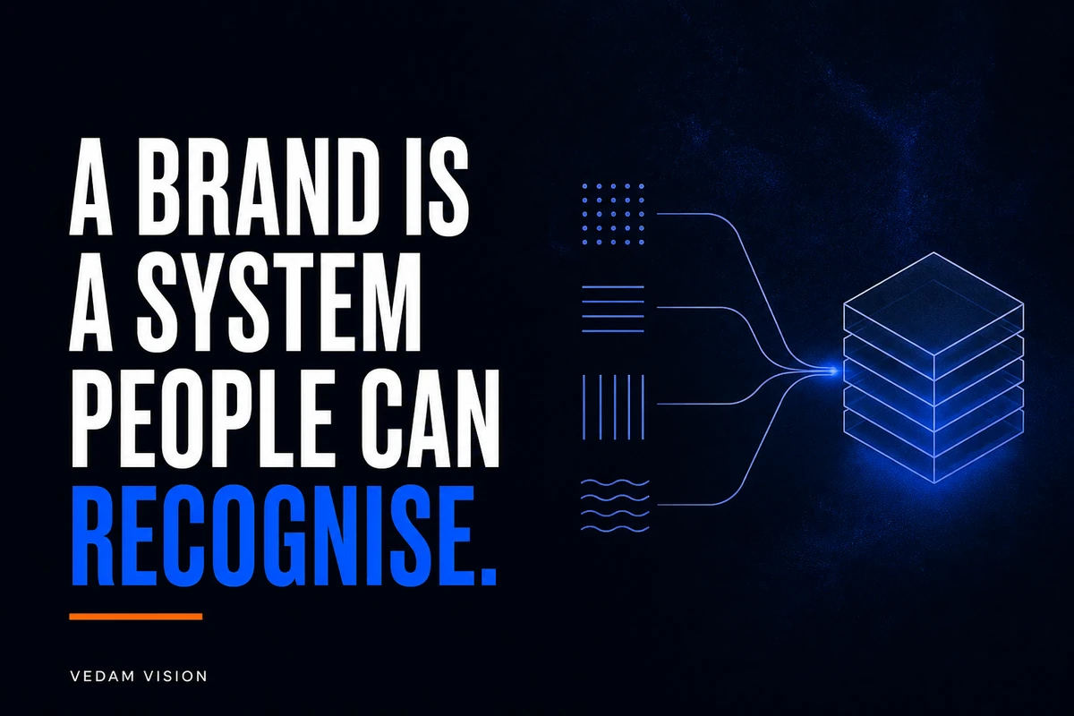
A brand identity for small business should give the team a repeatable way to present the business, not only a logo file. It connects the audience, offer, positioning, voice, colour, typography, imagery, layout, and customer touchpoints. A useful identity helps people recognise the business, understand what it offers, and receive a consistent experience across the website, proposals, social posts, emails, and delivery materials.
The logo remains important, but it is one component. A strong logo placed beside unclear messages, changing colours, unreadable text, and inconsistent service descriptions cannot create a coherent brand on its own. The value comes from the system and the decisions behind it.
Start with what the business needs people to understand
Before choosing shapes or colours, define the audience, offer, category, difference, and promise the business can actually keep. Write this in plain language. If a customer sees only one page, what should they understand about the business and whether it fits their situation?
Review the services overview and check whether the service names and descriptions support one clear picture. If every offer sounds unrelated, design consistency alone will not solve the problem. The identity needs a coherent business foundation.
A useful positioning statement is an internal decision tool, not necessarily a public slogan. It should help the team decide which messages, examples, partnerships, and visual choices belong. It should also identify what the business is not claiming.
A logo identifies, but a system communicates
A logo is a distinctive visual identifier. It can support recognition and may have trademark considerations, but it does not explain the complete offer, process, or customer experience. WIPO describes trademarks as signs capable of distinguishing the goods or services of one enterprise from those of others. Legal protection, registration, and availability depend on jurisdiction and professional advice; a design exercise is not a substitute for a trademark search or legal review.
The identity system explains how the logo is used with other elements. It should define approved versions, clear space, minimum size, backgrounds, and prohibited alterations. It should also explain what to do when the logo is not appropriate, such as a tiny interface or text-only context.
Preserve official logo assets exactly. Do not stretch, redraw, recolour, crop, or ask an image generator to imitate them. A small business benefits more from one correctly used mark than many approximations.
Positioning gives the identity direction
Positioning clarifies who the business serves, what problem it addresses, the category in which it competes, and why a suitable buyer may choose it. Without this, visual work can become a matter of founder preference rather than audience and business fit.
Translate positioning into design criteria. A business that needs to feel careful and dependable may prioritise clarity, restrained motion, accessible typography, and evidence. A youth-focused entertainment brand may make different choices. Neither direction is automatically better. The design must support the intended perception and remain usable in real applications.
Test the criteria against the portfolio and public examples the business is permitted to show. Do the projects, messages, and visual language support the stated position, or do they create a different impression?
Voice makes the brand recognisable without visuals
A brand identity includes the way the business writes and speaks. Define a small set of voice principles with examples. “Clear, practical, and respectful” is more useful when the guide shows what that means in a service description, error message, proposal, and social caption.
Distinguish voice from tone. The underlying character can remain consistent while the tone changes with context. A payment reminder should not sound like a launch announcement. A validation error should help the user recover, not perform the brand personality.
List words the business uses for services, customers, outcomes, and calls to action. Also list terms to avoid because they are vague, inflated, exclusionary, or inconsistent. This reduces the need to rewrite the same decision across every channel.
Colour should be usable, not merely attractive
Choose a primary palette, supporting palette, neutral colours, and functional colours for success, warning, error, focus, and interactive states. Define how each colour is used. A palette without usage roles leaves teams guessing.
Text and interface components need sufficient contrast. W3C guidance explains minimum contrast requirements for text and non-text interface elements under WCAG. A logo itself has a specific exception, but that does not make low-contrast body copy, buttons, or form states acceptable. Test actual combinations at the sizes and weights used.
Do not rely on colour alone to communicate status. Pair it with text, icons, patterns, or other cues. A red border without an error message may be invisible in meaning to some users.
Typography creates hierarchy and rhythm
Define typefaces, fallbacks, weights, sizes, line heights, and roles for headings, body text, labels, captions, and data. Small teams often need fewer styles than they expect. A compact type scale is easier to apply consistently than a long list of near-identical sizes.
Test the type system on mobile, in long paragraphs, tables, forms, and presentation slides. A display typeface that works in a large campaign headline may not work for a small navigation label. Use real content rather than placeholder text when testing.
Do not turn important text into images simply to preserve a font. Text should remain selectable, responsive, and accessible wherever possible.
Imagery and illustration need a point of view
Define which subjects, compositions, lighting, crops, colours, and treatments fit the brand. Explain what the image should communicate. “Use modern photos” is too vague to guide a photographer, designer, or content team.
For a service business, useful imagery may show the work, process, people, decisions, or outcomes that can be documented honestly. Generic staged images can make very different companies look the same. Do not invent client situations or imply a team, office, or result that does not exist.
Every image needs a delivery rule: aspect ratios, file formats, focal area, accessibility text where needed, and an owner for source permissions. The website’s blog library and social channels may require different crops, but they should still feel related.
Layout rules make the identity scalable
A few layout principles can save a small team hours. Define page width, spacing rhythm, grid, corner radius, border treatment, image placement, alignment, and density. These decisions help websites, decks, proposals, and social posts share a visual language without looking identical.
Document reusable patterns such as hero sections, service cards, callouts, quotes, data tables, and calls to action. Use a consistent pattern only when the content purpose is the same. A system should reduce arbitrary decisions, not force every message into one template.
The GOV.UK Design System offers a public example of documenting typography, colour, images, layout, and spacing as reusable styles. A small business needs a much smaller system, but the principle is relevant: define how elements work, not just what they look like.
Customer touchpoints reveal whether the identity works
Test the identity in the moments customers experience: search result, website, enquiry form, email, proposal, invoice, meeting, delivery update, support message, and follow-up. The visual design and language should help the customer know where they are and what to do next.
Review the working process and make sure its language and layout match the promises made on service pages. A polished campaign followed by confusing onboarding weakens trust. Brand identity includes operational consistency where the customer can see it.
Use the contact page as a simple test. Are the labels, tone, error messages, confirmation, response expectations, and visual hierarchy aligned with the rest of the brand?
Practical deliverables for a small business
A useful identity package may include strategy summary, audience and positioning notes, message hierarchy, voice guidance, logo assets and usage, colour roles, typography, imagery direction, layout rules, templates, and examples. The exact package depends on the team and channels.
Prioritise deliverables people will use. A business that publishes proposals weekly may need a strong proposal template before a large library of decorative social patterns. A product company may need interface components and icon guidance. A local service may need signage, uniforms, vehicle applications, and location pages.
Store source files, export formats, font licences, image permissions, and template links in one governed location. Name files clearly and archive superseded versions. The team should know which asset is current without asking the designer each time.
Roll out the identity without breaking useful work
Inventory the current touchpoints and prioritise by customer importance, reach, risk, and effort. Update core destinations first: website navigation, service pages, contact routes, proposals, email signatures, and active social profiles. Then address lower-frequency materials.
Do not change every historical asset solely for visual uniformity. Preserve legally required records, published evidence, and content whose context would be damaged. Redirect or replace outdated files when the business has a clear reason.
A free audit request can provide a structured starting point for reviewing current website presentation, but the business should still define its strategic brand questions before expecting visual changes to solve them.
Govern the identity after launch
Assign owners for messaging, visual assets, website components, and templates. Define who can approve new variations and how an exception is documented. Without governance, a library of files becomes another source of inconsistency.
Review new materials against a short checklist: audience, message, logo usage, colour role, typography, image direction, accessibility, and next action. Reserve a deeper review for major campaigns or new channels.
Update the system when the business changes, not whenever someone becomes bored with it. A new service, audience, market, legal constraint, or accessibility finding can justify change. Personal preference alone should not trigger repeated redesign.
Measure clarity and usefulness, not visual novelty
Ask customers and staff whether they understand the offer and can find the right materials. Review whether proposals, website pages, and social posts describe services consistently. Track production errors, duplicate template work, and repeated questions that the identity system should answer.
Do not claim that a new identity caused business growth without appropriate evidence. Many changes occur together. Record the rollout and evaluate patterns across recognition, clarity, usability, and team efficiency.
A brand identity for small business is an operating tool
A brand identity for small business becomes valuable when it helps the team make consistent decisions. The logo identifies the business. Positioning, voice, colour, typography, imagery, layout, templates, and touchpoint rules help it communicate and operate.
Build the smallest system that covers real work, test it in everyday formats, preserve official assets, meet accessibility needs, and assign owners. The result is not a collection of decorative rules. It is a practical foundation that helps customers recognise the business and helps the team present it with confidence.